Ever found yourself squinting at your iPhone screen like it’s the sun on a summer day? Enter Classic Invert, the feature that’s here to save your eyes and your sanity. This nifty little option flips the colors on your screen, turning those blinding whites into soothing blacks, making it a game-changer for anyone tired of the glare.
Understanding Classic Invert On iPhone
Classic Invert is a built-in accessibility feature on the iPhone. This tool enhances visibility by reversing screen colors, which can alleviate eye strain and improve readability for users.
Definition And Purpose
Classic Invert changes colors on the display from bright white backgrounds to deep black shades. This change provides a comfortable viewing experience for users in low-light environments. The feature is especially useful for individuals with sensitivity to bright screens. By swapping colors, Classic Invert makes it easier to read text and view images without glare.
How It Differs From Smart Invert
Smart Invert also adjusts screen colors, but it operates differently from Classic Invert. Smart Invert preserves the colors of images, multimedia, and certain app interfaces while reversing the background colors. This preservation helps maintain a natural look for media, ensuring that photos and graphics appear as intended. Users looking for a more nuanced color change often favor Smart Invert, while those needing a more straightforward inversion may choose Classic Invert.
How To Enable Classic Invert On iPhone
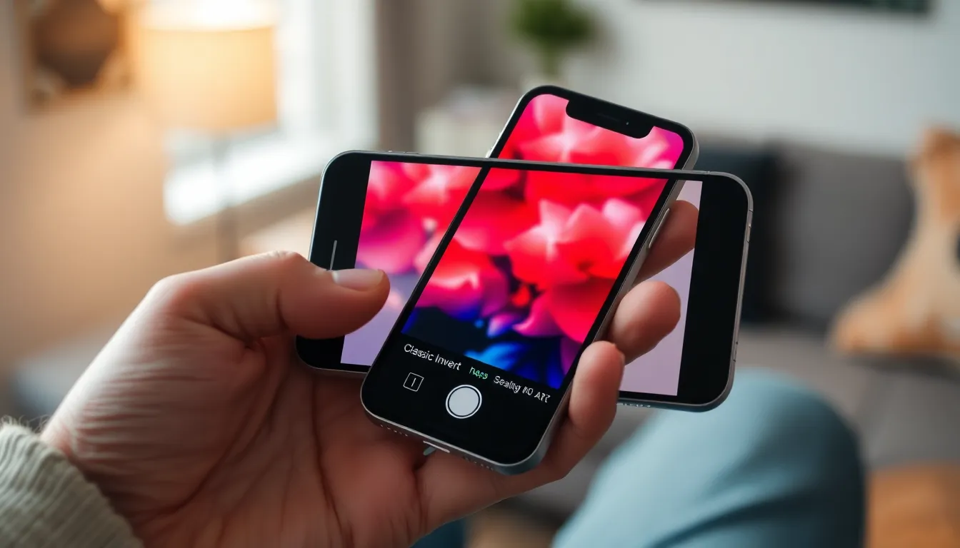
Enabling Classic Invert on an iPhone enhances visibility by reversing display colors. Follow these steps for activation.
Step-By-Step Guide
- Open the Settings app on the iPhone.
- Tap Accessibility to access various options.
- Select Display & Text Size for display settings.
- Find Classic Invert and toggle it on.
- Exit Settings and observe the color changes on the screen.
Classic Invert now activates, allowing for improved readability and eye comfort.
Troubleshooting Common Issues
Sometimes, users encounter issues with Classic Invert. If the feature doesn’t activate, ensure the device is updated to the latest iOS version. Restarting the iPhone often resolves minor glitches too. Confirm that Classic Invert is turned on within the Accessibility settings. If problems persist, resetting all settings may help. This action won’t delete personal data but restores system preferences. Lastly, consulting Apple Support provides additional assistance for unresolved issues.
Benefits Of Using Classic Invert
Classic Invert offers several advantages, particularly for users needing improved screen visibility and comfort.
Accessibility Features
Accessibility features are vital for enhancing user experience on iPhones. Classic Invert allows users with visual impairments or sensitivity to bright light to enjoy a more tailored browsing experience. Customizability in color settings meets various needs, ensuring everyone can access their devices comfortably. Additionally, Apple designed Classic Invert to help users navigate content without strain, making devices usable for a broader audience.
Visual Comfort
Visual comfort significantly improves with the use of Classic Invert. Bright background colors can cause discomfort during prolonged screen time. This feature transforms harsh whites into softer blacks, reducing glare and making text easier to read. Users commonly report less eye fatigue, especially in low-light situations. Enhanced contrast helps to delineate text and images, making them more distinguishable. Overall, Classic Invert fosters a more enjoyable and stress-free viewing experience.
Limitations Of Classic Invert
Classic Invert, while beneficial for many, presents limitations. Users with specific visual needs may find it unsuitable.
Not Suitable For All Users
Some individuals, particularly those with certain visual impairments or color blindness, may experience challenges when using Classic Invert. Its stark color reversal can disrupt natural color perception. A person who relies on subtle color cues in their work might feel frustrated by the inversion. Those accustomed to traditional color schemes may experience a learning curve. Experimenting with settings could yield better results. Ultimately, Classic Invert may not cater to every user’s unique needs.
Potential App Compatibility Issues
Certain apps may not function properly with Classic Invert activated. Graphic design tools and photo editing applications often display colors inaccurately after inversion. Users may notice discrepancies in color representation, affecting their work quality. Games and video streaming applications can also exhibit visual issues, diminishing user experience. Incompatibility can lead to confusion and dissatisfaction. Developers may not have optimized their apps for accessibility features. Adjusting settings outside of the app can sometimes improve functionality, but it doesn’t guarantee a seamless experience.
Classic Invert on the iPhone serves as a valuable tool for users seeking a more comfortable viewing experience. By reversing screen colors it effectively reduces glare and eye strain making it ideal for those sensitive to bright displays. While it offers significant benefits in terms of visibility and readability it’s essential to consider its limitations. Certain apps may not function optimally with Classic Invert activated which could affect the overall user experience. For those who prioritize accessibility features this option provides a straightforward solution to enhance daily device interactions. Ultimately Classic Invert highlights the importance of customizable settings in creating a more inclusive digital environment.